Project information
- Category: Modeling, Estimation
- Source Data: Download
Project Details
Data Description
Lung cancer is a type of cancer that begins in the lungs. Your lungs are two spongy organs in your chest that take in oxygen when you inhale and release carbon dioxide when you exhale. Lung cancer is the leading cause of cancer deaths worldwide and most often occurs in people who smoke. The dataset has multiple variables below. The data comes from R programming language.
The goal of the data is to understand the survival of lung cancer patients using time-to-event analysis.
What is survival analysis?
It is a collection of statistics for analyzing the expected duration of time until one or more events occur. It is also known as duration analysis, time-to-event analysis, reliability analysis and event history analysis. It can be used in follow fields of research:
- Medical: Understanding patient survival when diagnosed with a deadly disease.
- Medical: Hospital readmission duration after a major surgery.
- Industry: When would battery permanently die/fail.
- E-commerce: after seeing ads when a person would buy the product.
- Human resource: When an employee would leave a company.
There are multiple methods used to understand the time to even data. I am going to talk about the following types of models and try to understand their mechanism in time-to-event analysis.
- Kaplan-Meier Estimate (non-parametric)
- COX Proportional Hazard Model (Semi- parametric)
- Accelerated Failure Time Model (Parametric)
Python Packages:
- Lifelines
- Matplotlib
- Pandas
- numpy
Roadmap:
- Load the data
- Analyze and visualize the dataset
- Imputing missing values
- Kaplan Meier curve estimation
- Fitting Cox Proportional Hazard Regression
- Cox model results interpretation
- Testing Proportional Hazard assumption
- Fitting Accelerated Failure Time (AFT) Model
- AFT model results interpretation
Step 1:
Import packages:
#import libaries
import numpy as np
import pandas as pd
from lifelines import KaplanMeierFitter
import matplotlib.pyplot as plt
from lifelines.utils import median_survival_times
from lifelines import CoxPHFitter
from lifelines.statistics import proportional_hazard_test
from lifelines import WeibullFitter,ExponentialFitter,LogNormalFitter,LogLogisticFitter
from lifelines import WeibullAFTFitter
file_path=r'C:\Users\shang\Desktop\ML\data\lung cancer.csv'
columns=['inst','time', 'status', 'age', 'sex', 'ph.ecog', 'ph.karno','pat.karno', 'meal.cal', 'wt.loss']
df = pd.read_csv(file_path, names=columns)
print(df.head())

Step2: Analyze and visualize the dataset
df=df.drop('inst', axis=1)
df["status"] = df["status"] - 1
df["sex"] = df["sex"] - 1
# display base statistical analysis regarding the data
print(df.describe())

# display summary of missing values
print(df.isnull().sum())
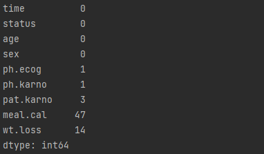
df["ph.karno"].fillna(df["ph.karno"].mean(), inplace = True)
df["pat.karno"].fillna(df["pat.karno"].mean(), inplace = True)
df["meal.cal"].fillna(df["meal.cal"].mean(), inplace = True)
df["wt.loss"].fillna(df["wt.loss"].mean(), inplace = True)
df.dropna(inplace=True)
df["ph.ecog"] = df["ph.ecog"].astype("int64")
- Remove it entirely but it will reduce the sample when you have a small sample size.
- Fill in with mean/median or with a particular value.
- Use k nearest neighborhood model to estimate value.
print(df.isnull().sum())

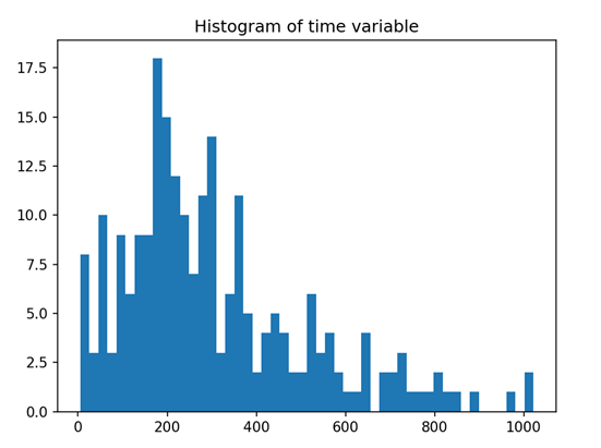
# Data Distribution
T = df["time"]
E = df["status"]
plt.hist(T, bins = 50)
plt.show()
Kaplan-Maier Curve Estimation (Non-Parametric)
What is KM?
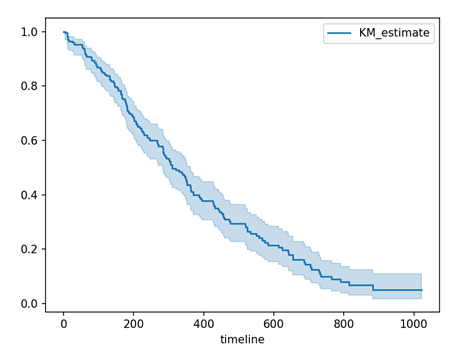
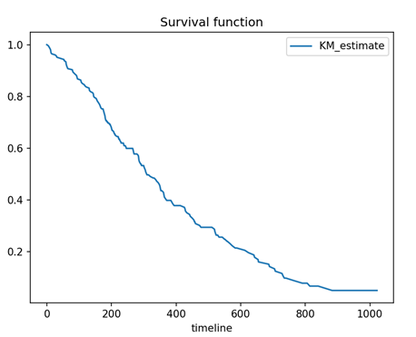
The Kaplan-Meier approach, also called the product-limit approach, is a popular approach which re-estimates the survival probability each time an event occurs. It is a non-parametric method, means it does not assume the distribution of the outcome variable (i.e., time).
# Kaplan-Meier Curve Estimation
kmf = KaplanMeierFitter()
kmf.fit(durations = T, event_observed = E)
kmf.plot_survival_function()
plt.show()
# without 95% confidence interval
kmf.survival_function_.plot()
plt.title('Survival function')
plt.show()
#Median Survival Time and Confidence Intervals
median_ = kmf.median_survival_time_
median_confidence_interval_ = median_survival_times(kmf.confidence_interval_)
print("Median survival time:"+str(median_))
print("Median 95% confidence interval:"+str(median_confidence_interval_))

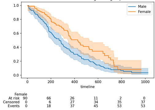
#Gender Categories
ax = plt.subplot()
m = (df["sex"] == 0)
kmf.fit(durations = T[m], event_observed = E[m], label = "Male")
kmf.plot_survival_function(ax = ax)
kmf.fit(T[~m], event_observed = E[~m], label = "Female")
kmf.plot_survival_function(ax = ax, at_risk_counts = True)
plt.title("Survival of different gender groups")
plt.show()
# Anaylze for ph.ecog categories
ecog_types = df.sort_values(by = ['ph.ecog'])["ph.ecog"].unique()
for i, ecog_types in enumerate(ecog_types):
  ax = plt.subplot(2, 2, i + 1)
  ix = df['ph.ecog'] == ecog_types
  kmf.fit(T[ix], E[ix], label = ecog_types)
  kmf.plot_survival_function(ax = ax, legend = False)
  plt.title(ecog_types)
  plt.xlim(0, 1200)
plt.tight_layout()
plt.show()
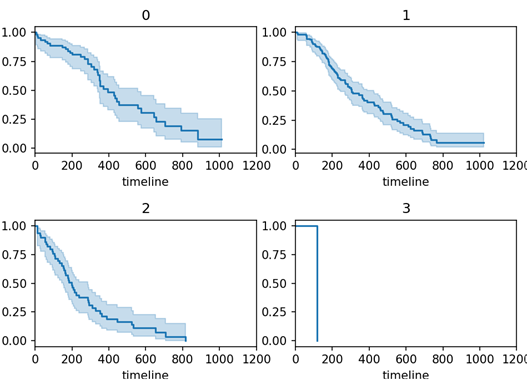
df = df[df["ph.ecog"] != 3]
print(df.shape)
In summary, Kaplan-Meier Curve Estimation is useful for estimating the survival probability each time an event occurs for individual or group.
Cox Proportional Hazard Model (Semi-Parametric)
What is Cox-PH model?
Cox-PH model is a semi-parametric model which solves the problem of incorporating covariates. In Cox’s proportional hazard model, the log-hazard is a linear function of the covariates and a population-level baseline hazard.
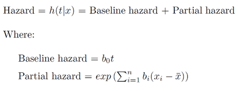
The first term is the baseline hazard and the second term known as partial hazard. The partial hazard inflates or deflates the baseline hazard based on covariates.
Cox proportional hazards regression model assumptions includes:
- Independence of survival times between distinct individuals in the sample.
- A multiplicative relationship between the predictors and the hazard.
- A constant hazard ratio over time.
Definition of Hazard and Hazard Ratio
- Hazard is defined as the slope of the survival curve. It is a measure of how rapidly subjects are dying.
- The hazard ratio compares the two groups. If the hazard ratio is 2.0, then the rate of deaths in one group is twice the rate in the other group.
# hot code categorical variable
d_ecog = pd.get_dummies(df["ph.ecog"], prefix = 'ecog')
print(d_ecog.head())
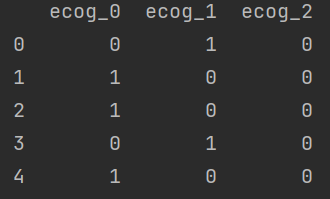
d_ecog = d_ecog[["ecog_1", "ecog_2"]]
df = pd.concat([df, d_ecog], axis = 1)
df = df.drop("ph.ecog", axis = 1)
print(df.head())

cph = CoxPHFitter()
cph.fit(df, duration_col = 'time', event_col = 'status')
print(cph.print_summary())
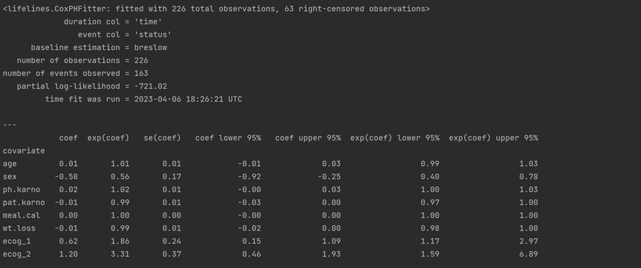
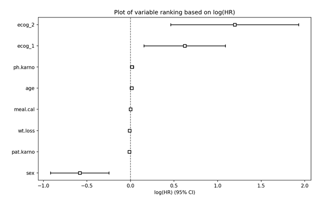
#Plot of variable ranking based on log(HR)
plt.subplots(figsize = (10, 6))
cph.plot()
plt.title("Plot of variable ranking based on log(HR)")
plt.show()
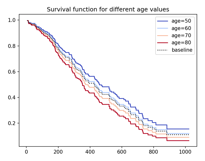
# Plot Partial Effects on Outcome
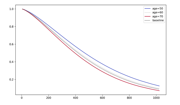
cph.plot_partial_effects_on_outcome(covariates = 'age', values = [50, 60, 70, 80], cmap = 'coolwarm')
plt.title("Survival function for different age values")
plt.show()
#Check Proportional Hazard Assumption
print(cph.check_assumptions(df, p_value_threshold = 0.05))
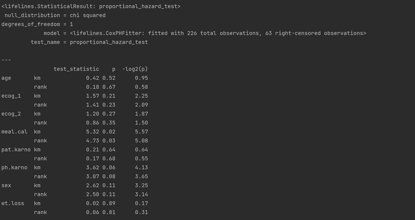
res = proportional_hazard_test(cph, df, time_transform='rank')
print(res.print_summary(decimals=3, model="untransformed variables"))

Accelerated Failure Time (AFT) Model
What is AFT?
Accelerated Failure Time (AFT) is one of the popular parametric models used in survival analysis. The model assumes that the survival function follows a parametric continuous distribution. For instance, one can assume a Weibull distribution or a Log-normal distribution.
The parametric AFT model assumes that survival function that derived from say two population (for example P and Q) are related by some acceleration factor lambda (λ), which can be modelled as a function of covariates.
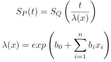
Acceleration Factor/Time Ratio as a function of covariates
Based on the covariates, the AFT model can accelerate or decelerate the failure times. The AFT model coefficients can be interpreted easily: a unit increase in a covariate means the average/median survival time changes by a factor of exp(b_i).
Identifying the best fitted distribution
There are many distributions available that we can fit. So the first step is to identify the best fit one. The common distributions include Weibull, Exponential, Log-Normal, Log-Logistic and Generalized Gamma.
# identify the best distribution
wb = WeibullFitter()
ex = ExponentialFitter()
log = LogNormalFitter()
loglogis = LogLogisticFitter()
# Fit to data
for model in [wb, ex, log, loglogis]:
    model.fit(durations = df["time"], event_observed = df["status"])
    print("The AIC value for", model.__class__.__name__, "is", model.AIC_)

# initialize model object
weibull= WeibullAFTFitter()
weibull.fit(df, duration_col='time', event_col='status')
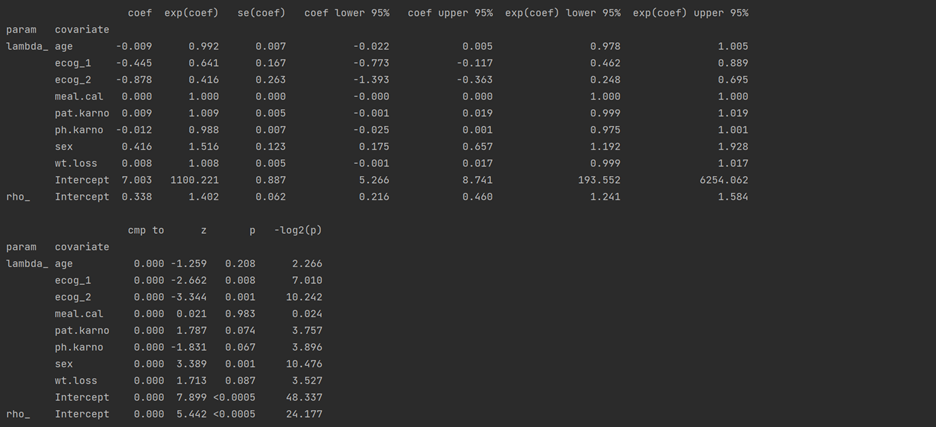
weibull.print_summary()
Example:
Sex containing [0: Male (base) and 1: Female] has a positive coefficient. It means being a female subject compared to male changes mean/median survival time by exp(0.416) = 1.516, approximately a 52% increase in mean/median survival time.
#Median Survival Time and Confidence Intervals
print("AFT median:"+ str(weibull.median_survival_time_))
print("AFT mean:"+str(weibull.mean_survival_time_))

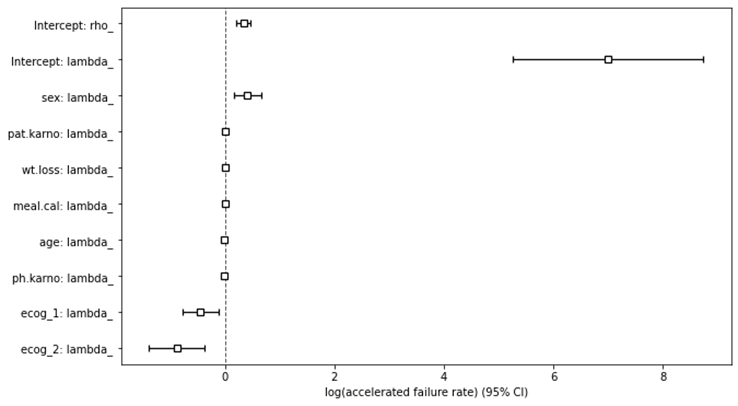
# plot variable ranking
plt.subplots(figsize=(10, 6))
weibull.plot()
plt.show()
#Plot Partial Effects on Outcome (Weibull Regression)
plt.subplots(figsize=(10, 6))
weibull.plot_partial_effects_on_outcome('age', range(50, 80, 10), cmap='coolwarm')
plt.show()
